At Instant Promotion we use dye sublimation printing to embed the colours into 600 denier fabric, ensuring a long-lasting finish. Dye sublimation is the process of turning a dye ink into a gas that bonds with polyester fabric or other polymers. Unlike screen printing, where the ink sits on top of the fabric, dye sublimation bleeds the ink into the fabric itself, resulting in a vibrant graphic that never washes off the fabric.
Accurate colour management is imperative to maintaining brand integrity and this is therefore a key element of our print production process. To ensure that we provide our clients with an accurate and consistent colour representation, our printer colour profiles are accurately calibrated to international printing standards. This ensures that we can print the correct intended colour for our clients, regardless of the printer being used. In addition, our colour management process ensures that the printed colour is consistent from one print run to the next.
When you first view your visuals you will view them on a screen, which uses RGB colour mode. RGB creates colour by emitting a combination of red, green & blue lights. RGB is referred to as an additive colour model because white is created by adding all 3 colours. These colours may vary from screen to screen depending on the calibration of each device.
CMYK colour mode creates colours using 4 inks - cyan, magenta, yellow & key (black). It is called a subtractive colour model because white is obtained with the absence of all 4 inks. The colour ranges of RGB & CMYK do not directly match up, and while all efforts are taken to match them exactly, it isn’t always possible.
Most graphics software allows you to work in either RGB or CMYK colour mode. RGB is primarily for artwork that is to be viewed on screen, for example on websites, whereas CMYK is for artwork that will be printed. To ensure colour accuracy, we ask that you avoid saving artwork in RBG colour mode, and use Pantone colours where possible.
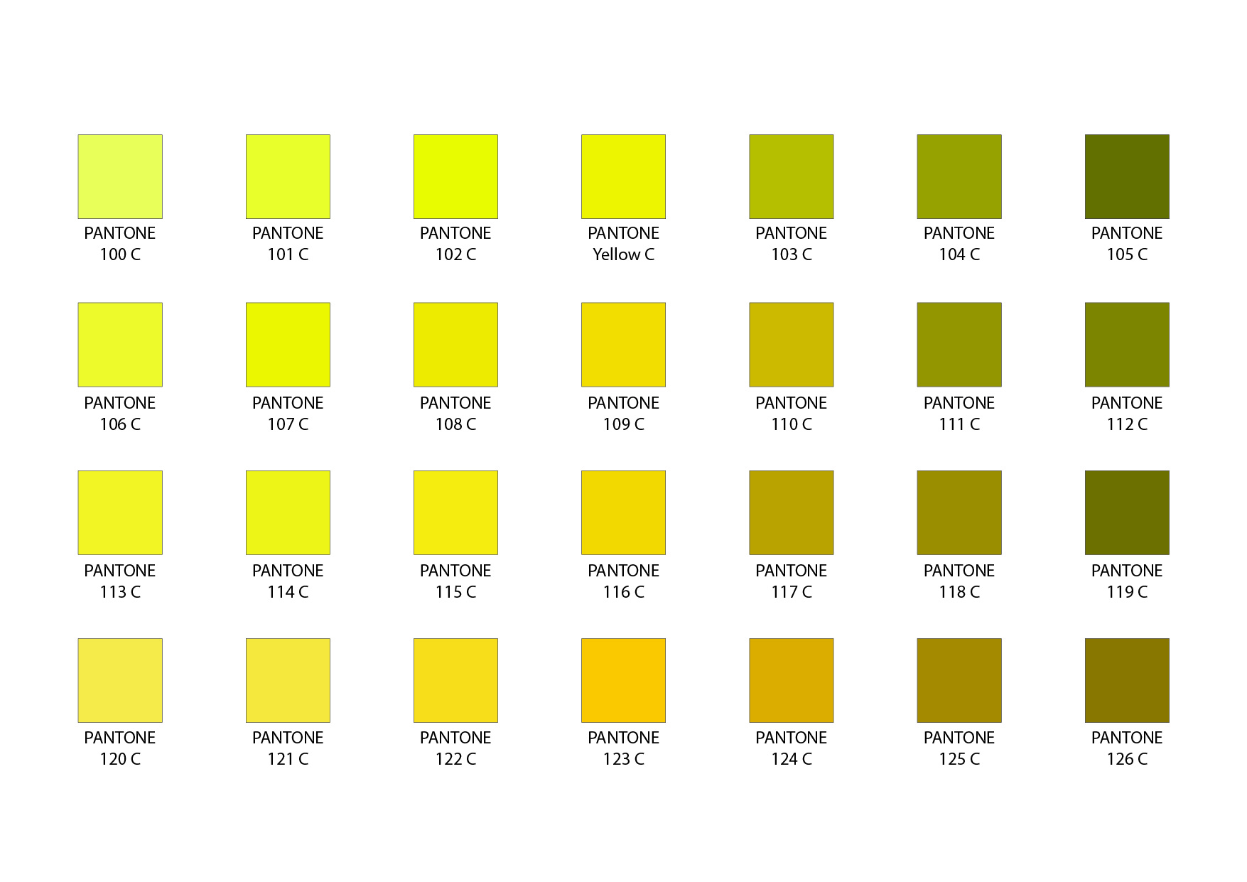
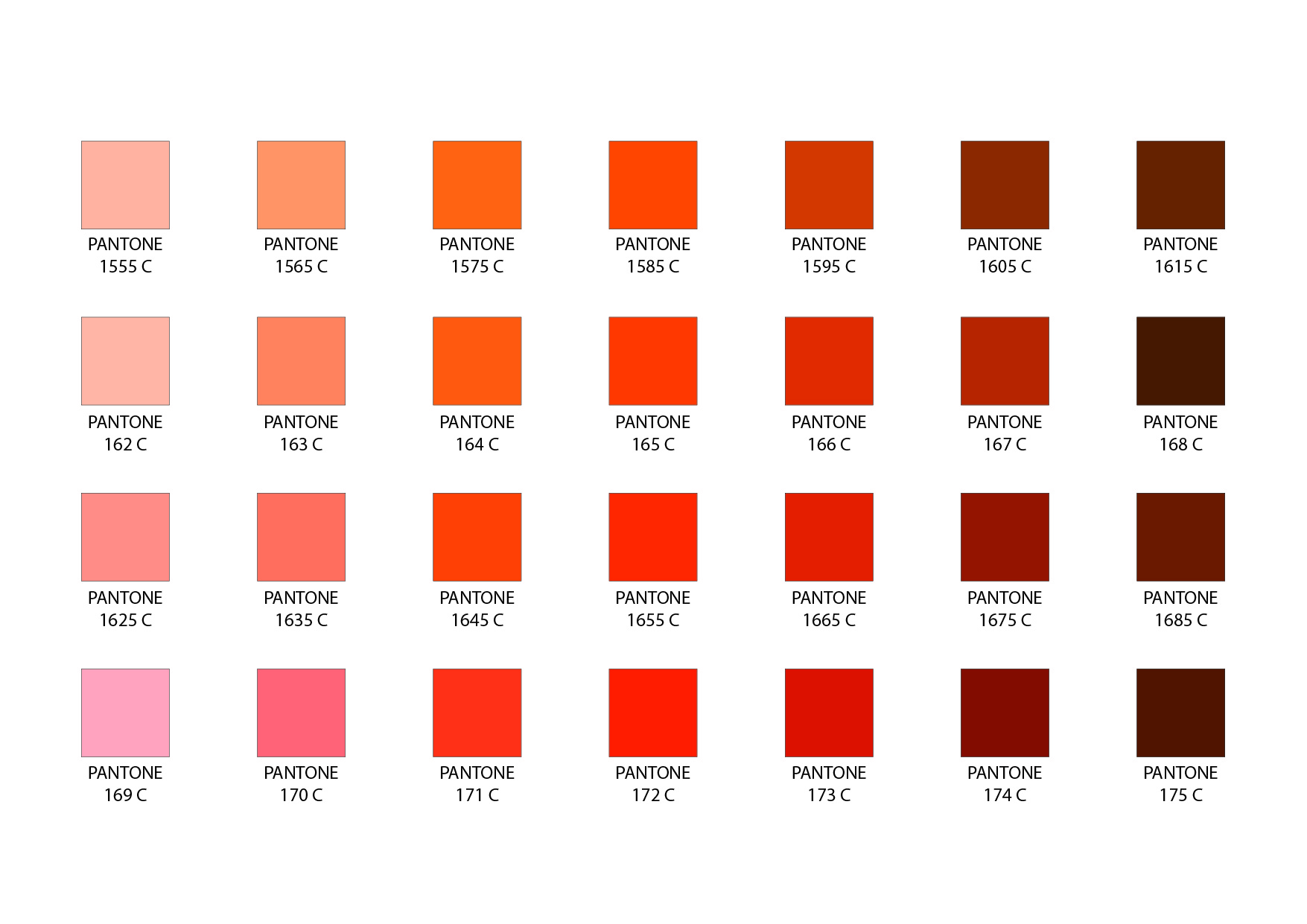
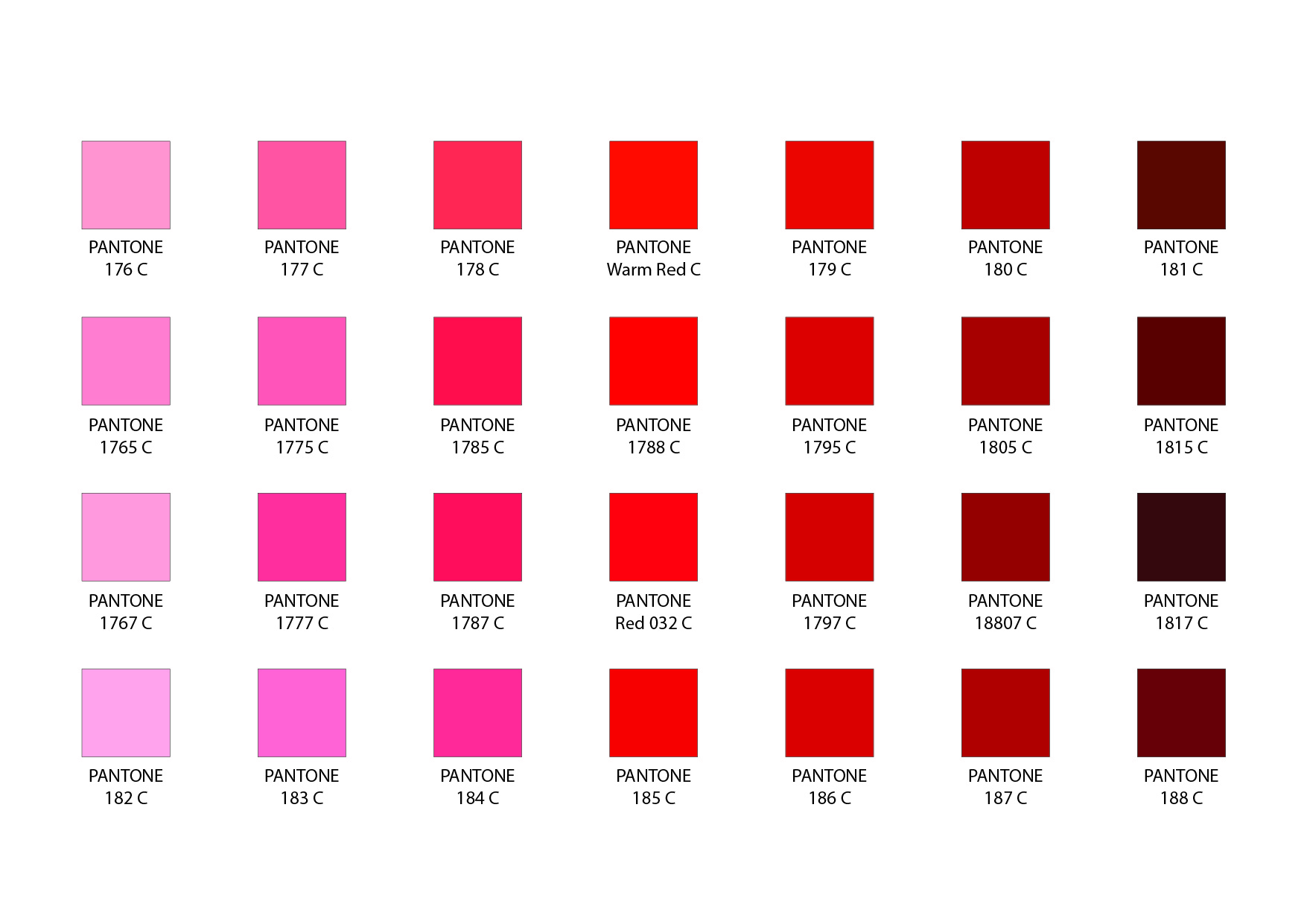
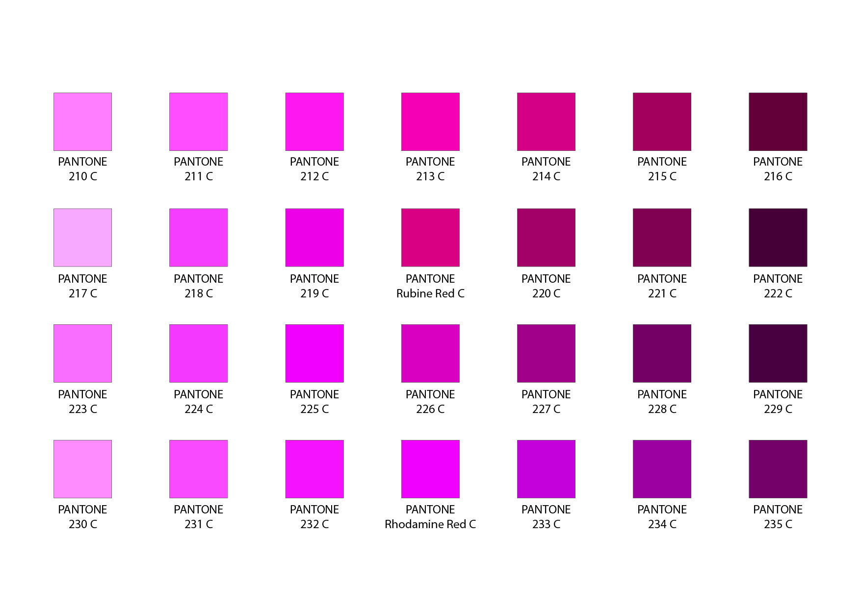
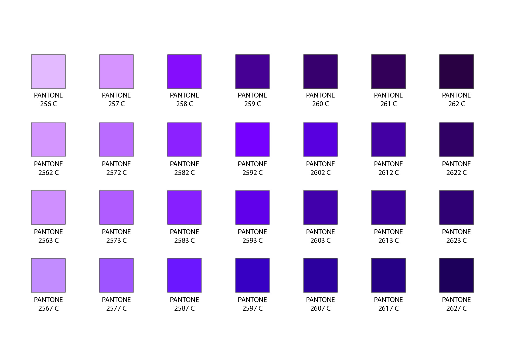
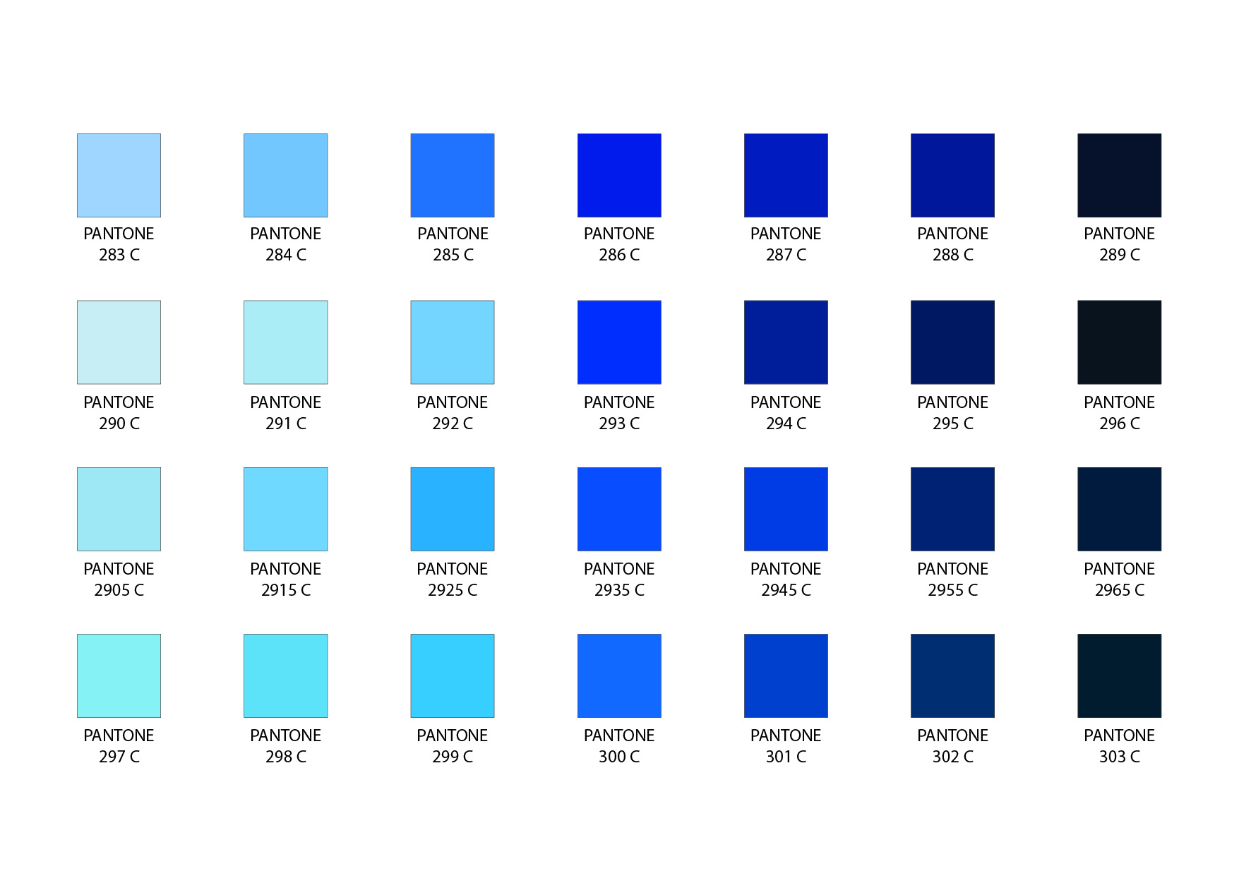
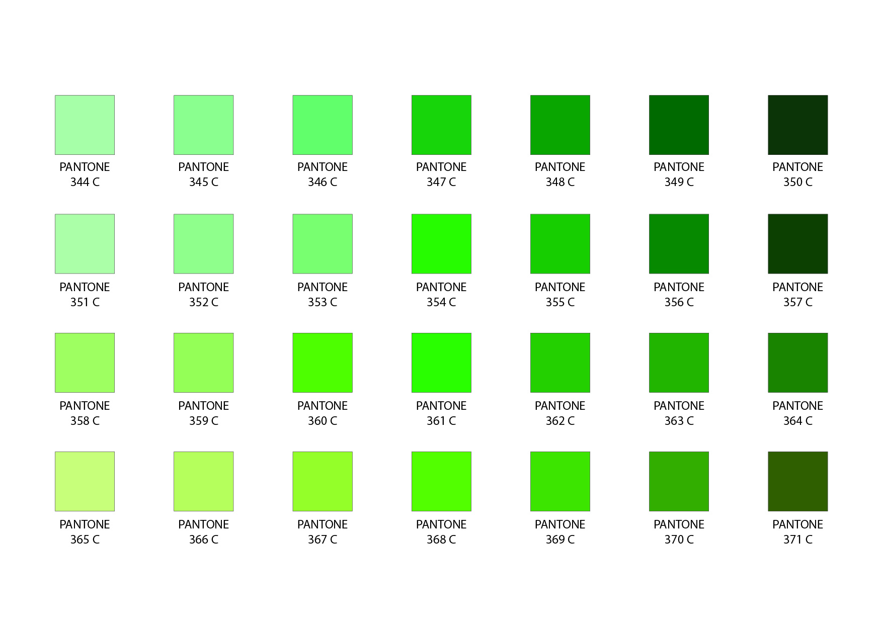
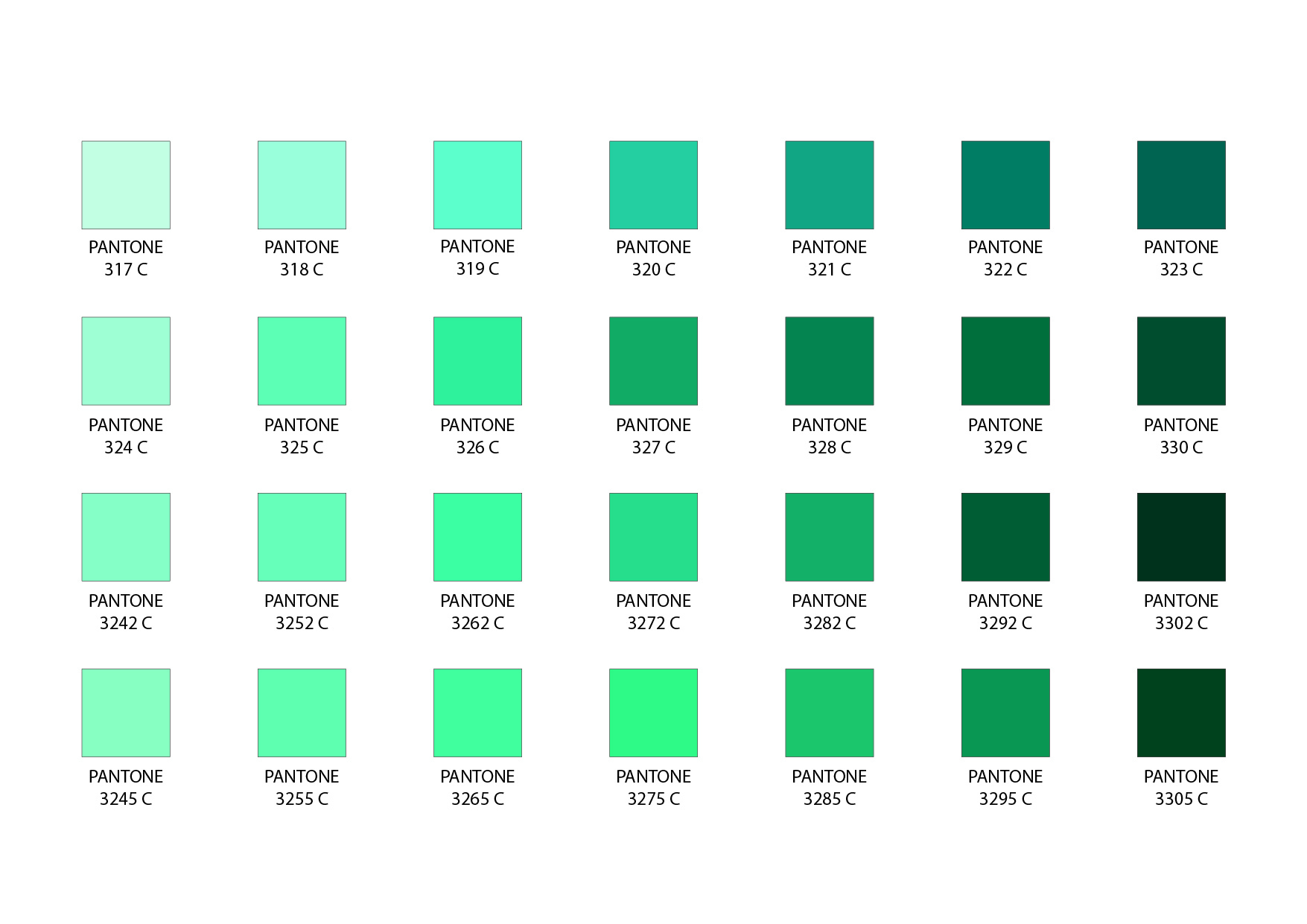
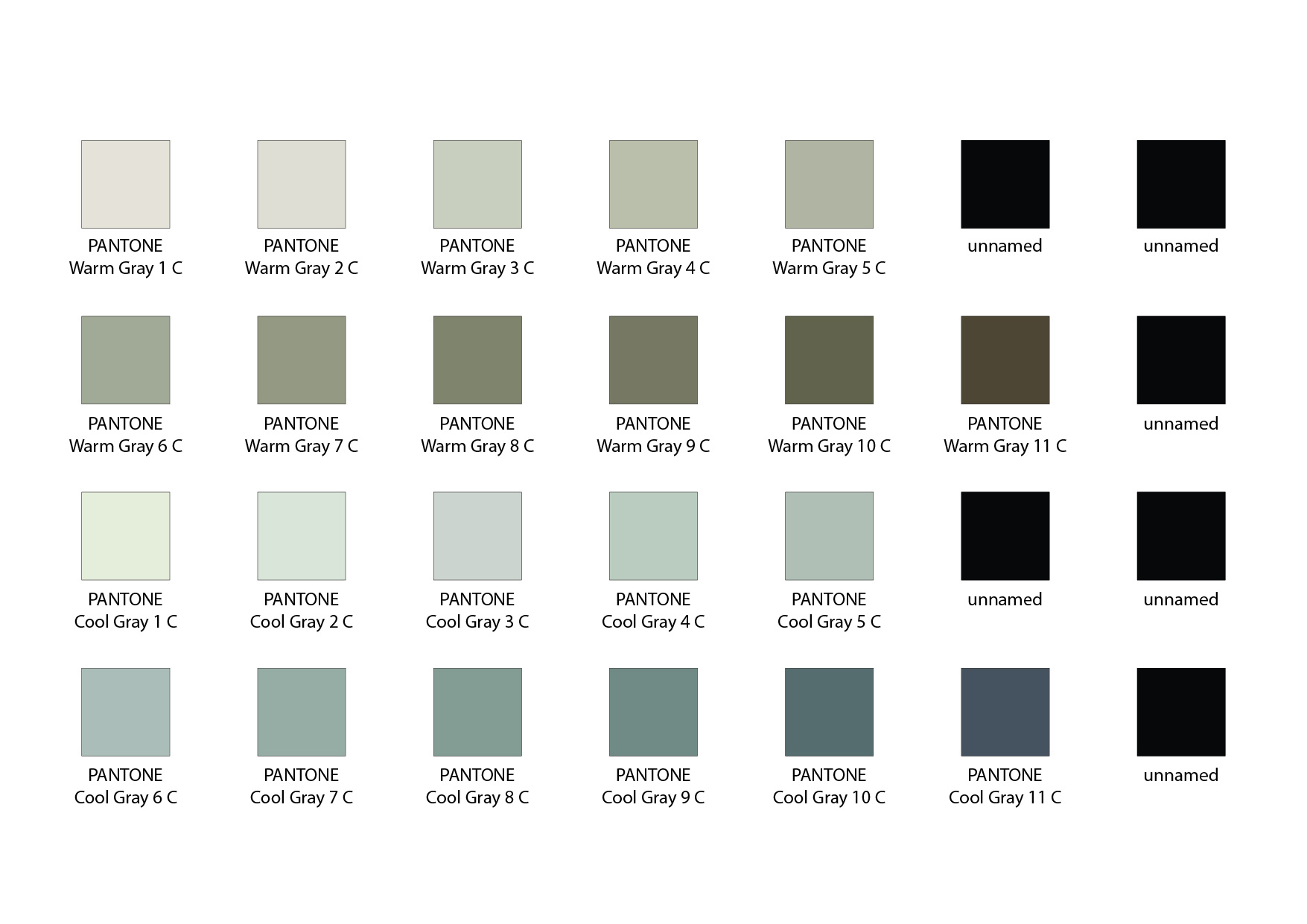
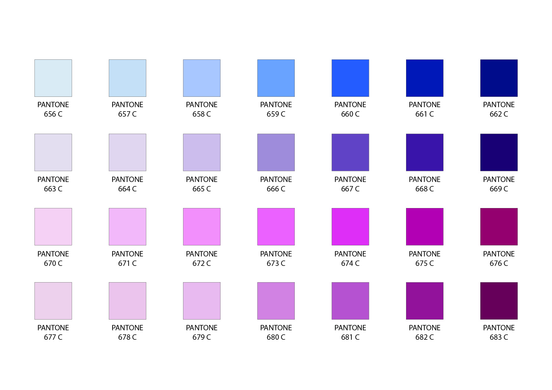
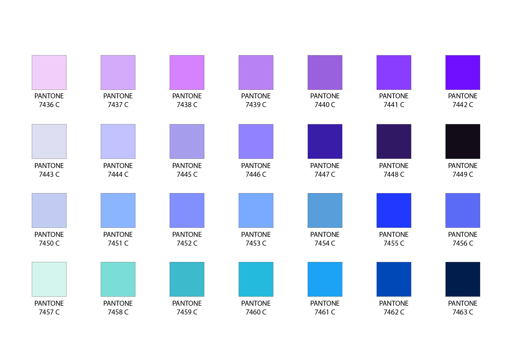
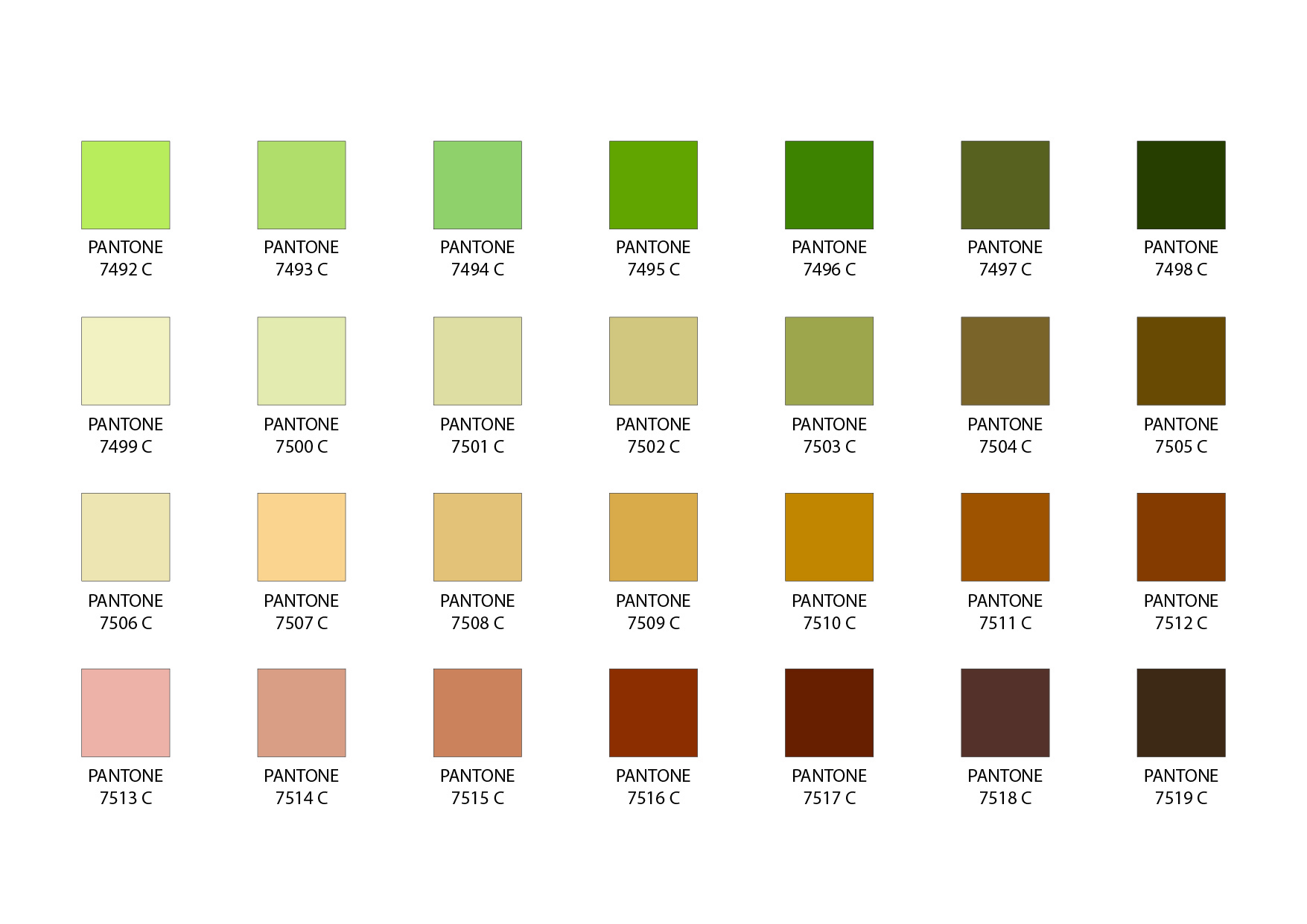
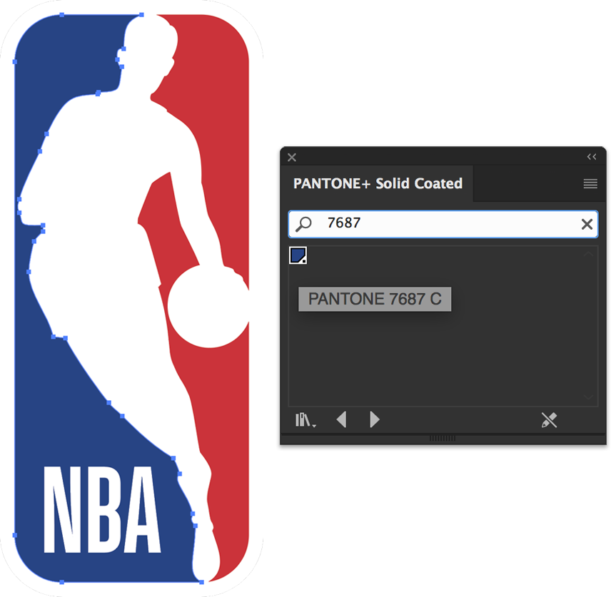
PANTONE®
Using Pantone colours allows us to match your brand colours accurately and maintain colour consistency when printing, so please let us know if you have any specific Pantone colours in your artwork that you require us to match. This is particularly necessary for large areas of block colour, for instance, the background colour of your canopy.
For more details, click here to download our Artwork Requirements.